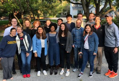
A group of 17 people standing close together posed for the photo in a residential neighborhood with large trees.
Carleton Weitz Fellows | May 31, 2022
Weitz Insights
The Weitz Family Foundation logo icon has a dark blue square border. Inside the border, there are four layers of waves in dark blue, aqua, orange, and teal. Below the waves, the text reads "Weitz" in bold, dark blue font and "Family Foundation" in a light, dark blue font.
General | July 14, 2022
This is the moment we have been waiting for— The Weitz Family Foundation has a new brand and website! We’ve been deliberating and experimenting for over a year about how to communicate our work and mission.
Twenty years ago, my parents started our foundation with the intent to uphold our values of integrity, compassion, dedication, transparency, and innovation. We continue to be inspired by the dreamers and innovators of our community, those who are acting to uplift racial equity, justice, accessibility, and peace.
Our purpose is to provide access to social and financial capital that is equitably distributed. We hold ourselves and our diverse grantees accountable for ensuring these funds reach the right people within our community. We operate from an authentic desire for innovation, progress, and results. We engage in and learn from the community to arrive at awareness and understanding that transforms into a culture of action.
Like the waves in our brand, we know this work takes layers upon layers to impact the landscape of our community. As we continue to learn about inequitable systems, we will adapt our practices to challenge them. We are honored to be part of this work and maximize our philanthropic energy to invest in our community.
Ensuring we are collaborating with vendors who align with our values and prioritize diversity and inclusion is at upmost important to our foundation. In this process, we’ve held ourselves accountable for partnering with local creatives and businesses owned by women, people of color, and members of the LGBTQIA+ community. We want to express our sincerest gratitude to our partners who helped us in our journey of our new brand and website:
This is an exciting, emotional moment for us because it demonstrates transparency and vulnerability that we hope has a lasting impact. This is about investing in the future of our community.
As we celebrate our 20th anniversary, we are seizing this opportunity to continue to grow and develop tools and resources to support organizations and partners. Dive into our website to learn more about our approach and opportunities available for your organization.

A group of 17 people standing close together posed for the photo in a residential neighborhood with large trees.
Carleton Weitz Fellows | May 31, 2022
